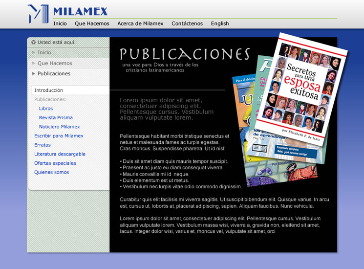
Slide 9 The main title bar spans whole width. This shows the parent template with a variation of the publications page
Although the most obvious difference in this slide is the stark black background alternative to the Publications section homepage, the thing to notice here is the re-positioning of the main title bar running across the top of the page.
The main title bar has been re-positioned to give more vertical room to the content beneath, and to give a more over-arching sense of branding to the page.
As with the deeper background colour, I'm not sure about this change, and would welcome any feedback.
