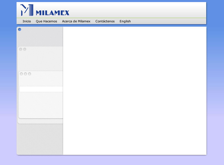
Slide 1 Initial sketching
As decided from the wireframe diagrams, I put main section links across the top, and sub-section links down the side.
The top links translate as follows:
- Inicio = Home
- Que Hacemos = What We Do (the biggest section, containing links to all our main ministries)
- Acerca de Milamex = About
- Contactenos = Contact Us
- English = A section for English-speaking visitors
Each of the 'palettes' floating leftwards from the page would contain sub-section navigation (to be shown in Slide 2 and onwards). One sits on top of another as you navigate deeper into the site, to give a sense of where the currently viewed page sits within the hierarchy. This stacking functions as a 'breadcrumb' trail.
I wanted to keep the main page area free of overlapping objects, bevelled corners or background artwork, to keep it a clean slate for creative content.
The inclusion of blue was something requested by the mission director, and I quite liked this background gradient effect.
