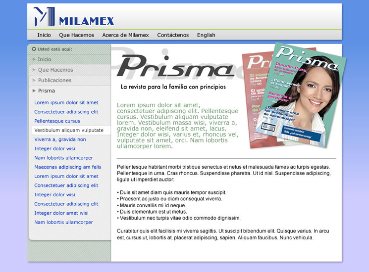
Slide 2 A proposed template showing a homepage for 'Prisma' magazine
After much experimentation, this was the first 'could be used' iteration of the template.
The section navigation palettes stack to represent where the Prisma section sits within the hierarchy. Each title is 'clickable' so you can return to the level above.
I removed the horizontal cascade from the palettes (as in Slide 1), as I felt this was not necessary to represent the concept of stacking, and only wasted space.
Further definitions not given earlier:
- Usted esta aqui = You are here (with reference to the 'breadcrumb' trail beneath)
- 'Lorem ipsum...' = Non-sensical filler text
About Prisma
Prisma is a popular family magazine by Milamex that has been in publication for over 40 years. It is one of many key activities, and is used throughout this presentation to illustrate how a typical ministry might be represented on the website.