Visualising Milamex.com
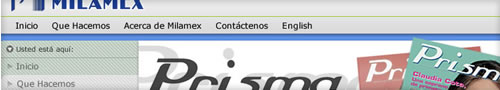
As mentioned in Progress report - the 10 stage plan last month, the next stage in the development of the Milamex website has been to come up with some visual designs for the site.
After battling through illness last month, and testing a shoot-out between graphics apps, I eventually came up with a visual design proposal for the new-look Milamex website. I presented the proposal to Sally, the mission director last week, and am happy to say she liked it.
However, that's not good enough for me, and I wanted to show the ideas here, to allow others to offer their feedback. I've presented the evolution of my visual ideas as a mini slideshow, with brief commentary alongside each picture.
To view the slideshow, cick on the button below, which will launch the show in a new window. Note: The pictures make better sense when you view them in numerical order - explanations and translations of key text are given as you go along.

If your browsers doesn't allow pop-up windows, click here to view the slideshow in the current window. Please note, you will need a monitor resolution of at least 1024x768 to view the show.
Feedback
Any feedback that others can provide is always really helpful, as otherwise I only have my intuition to go on. If you want to let me know what you think, I welcome you to leave a comment at the end of the blog, or drop me an email.
For the free-thinking, you can tell me whatever! However, if you want a bit of guidance on the sort of things I would like to know, here are some questions I've got for you:
- From what you can make out in the pictures and my explanation, does the navigation of the site seem initutitive or confusing? (Slides 1 and 2)
- Does the diversion into a micro site for each of our main activities and moving the 'breadcrumb' trail above the main page seem a good one, or would it lose you? (Slide 5)
- Which of the blue gradients in the background do you prefer - the lighter blue (that is softer on the eyes) or darker blue (that provides more contrast)? (Slides 5 and 8 make good comparisons)
- More broadly, do you like the colours, or would you choose different ones?
- Which of the main title bars do you prefer - the floated grey box above the main page area, or the grey bar which extends the full page width but takes up less vertical space? (Compare slides 5 and 10)
- The main page area (everything in the box below the title bar) is of fixed width. This allows me to do some pretty pixel-perfect picture positioning. Do you like this approach, or do you prefer layouts that extends automatically according to the width of your screen?
PS. If you're not 'tecchie', don't be intimidated by those who are - just drop me some thoughts - whether they be simple or clever.
posted by Tim Thompson | 2:38 PM
|
Post a Comment
![]()
![]()


7 Comment(s):
Nice work on the templates. Here are my thoughts:-
- I think the navigation is fairly intuitive
- I like the microsite idea. Just one question. Do you need to show the full site breadcrumb at all? How about just a "back to milamex" link? I would be interested to see a picture of this, as it may look wrong or act oddly, but I think it is worth mocking up.
- I am happy with pretty much all the suggested colour schemes.
- I quite like the main title bar full width at the top
- I personally have been going down the route of 'em's for height and 'ex's for width recently for text areas. 60ex is a nice width for a content area. Then again, in this respect I think I'm very odd! Thursday, July 06, 2006 6:07:00 PM
Hi ya Tim.
some comments for you, also just to say it's really good to be able to read about what your up to? and now the comments.
1. the navigation changed quite a bit through the slides, but the final ideas are the best.
2. I like the idea of the mini sites and the navigation as well as the main title allow you to always know where you are. and allow easy navigation back
3. I like the darker blue gradient it seems to fit with the blue in the Milamex, which ties it to it.
4. I like the colours i think the site looks clean and the colours contrast enough to allow it to stand out.
5. I like the title bar that stretches completely across the width of the screen, i believe as you mentioned it acts like an umbrella to all other sections.
6. I think as long as you stick to a standard size 1024 x 768 then a fixed width is fine... it never bothers me when i'm at a site as long as i can get the information i want.
Hope you find these comments useful?
Continue having a great time.
Dean Page Friday, July 07, 2006 10:03:00 AM
I'm a very proud Dad. Keep up the good work Tim. Friday, July 07, 2006 3:05:00 PM
I'm getting the hang of this now, Tim and I think it's going to work well. It's a little frustrating at the moment that you can't navigate the site properly, so I'll look forward to that one day. Like the dark blue.
Mx Monday, July 10, 2006 4:07:00 PM
Hello Hello Tim l think you are doing a very good job in Mexico. God most be so proud of you!! just keep yr eyes open to his will.
Estoy muy orgullosa de ti tambien, eres un hombre que quiere amar a Dios, Gracias por estar cerca de mi y enseniarme muchas cosas, aun en la distacia...tq
Dios te bendiga siempre!!
MUNIEKIS!! Friday, August 04, 2006 1:28:00 AM
Hi Tim, we met at Redcliffe last year, good to hear your news and theexcellent work you're doing over there.
God bless you
Julio Robles Friday, September 08, 2006 5:47:00 AM
Hey
I think you could use tableless templates and consider a full intuitive face for the site, it looks a bit plain as aposed to simple.
I do alot of work with Plone and know a few tricks (not trying to get a job just like lending a hand to ploners!) my latest site is www.nigd.org.
Peace
Wyn WIlliams-Kallio Wednesday, October 25, 2006 2:34:00 PM
Post a Comment