Progress report - the 10 stage plan

I have been promising for sometime to show progress on the Milamex website as it is being developed. I'm writing this as part of a planned series of 'progress' blogs to keep you in touch with what I'm doing. As I put up samples and screenshots of my work, if you have any thoughts or reaction to my ideas that you think would be helpful, this is an opportunity where you can give me feedback.
In this blog I play a little catch-up, as I take you from when the project began back in March, to where I'm at today, but I break it down into nice sub-headed sections, so you can skip to the bits that interest you the most.
The Process
Every website and software development project has what's called a 'project lifecycle', where the development is rationalised into phases. One UK design agency used a 5-stage process when working with my former company, where each stage was branded with a word beginning with 'E'. As I recall, something like: 'Enlighten', 'Envisage', 'Enable', 'Execute' and 'Equip'. Only a design agency could come up with that!
Well, maybe I'm not quite so well branded, but I've identified 10 key stages in my journey of bringing the Milamex website to life. I've hammered through five of the stages so far, with a projected launch date for 'Version 1' of the website in mid-August.
Below I talk a little about what I've done in the five stages already completed.
Stage 1: Consultation
This is quite an important phase, primarily in building my relationship and trust with the client. What I want at the beginning is for the website to be a success at the end, so it's important that we're thinking on the same wavelength, to avoid mis-understandings, false expectations, and make the process a fun and constructive one.
It is here that I ask questions like: What does the client want from the website? Who is the audience? How will the website make a difference to the organisation? After discussion, I often have my own ideas to add, and we discuss all the ideas we bring to the table.
At the end of the primary consultation phase in March with Sally, the mission director, (I say primary, because consultation is really an ongoing process), I had developed a good idea of what's needed to be done. I discuss a little bit about this phase in my earlier post Discovering Milamex.
At this stage, I also take client through a few visuals - either past websites I have designed, websites of other organisations in a similar market, or some plain conceptual websites. One great site I look to for inspiration as a designer is CSS Zen Garden, a wonderful fountain of conceptual website designs that always challenges me to be more creative. I took Sally through a number of visuals, and it gave me a good idea for her taste of colours, designs and layouts etc.
Stage 2: Planning timescales and deliverables
If I were designing a website as a freelance project, it would be very important to plan how long a project would take, and what I could actually achieve in a given timeframe, not least from the point of view of charging for the work. However, with Milamex, I'm not quite so bound by these constraints, as I have ample time, and am not charging for it! However, I am driven by a desire to serve God, and want to deliver a website that glorifies Him.
To deliver a website that will best serve Milamex, one of the skill areas I need to improve on is in programming. Although I have built up a lot of programming experience in recent years (including having attained an MSc in Computing), one of the things I need to do for the Milamex website is develop some type of database-driven content management system (CMS), an area which I've not ventured much into in the past. My timescales therefore need to factor in time for training in this area.
In April, it was my plan to spend some weeks/months refreshing my programming knowledge and develop the skills to design a CMS. However, as reported in my Guatemala post, one decision I made after returning from the Latin Link retreat in early May, which I strongly feel was lead by God, was to deliver a website in phases, so we could get a basic version launched sooner, with a more advanced version delivered in stages thereafter.
The idea here is that whilst I am developing more advanced functionality for the website, a simpler version (which to the public eye, won't be that much simpler) could be live, serving Milamex sooner. The principle type of functionality I need to develop thereafter is one which will allow Milamex to maintain the website themselves, and whilst this is essential for the longer term, it needn't be in place for day one.
On discussion with Sally, we have planned to launch a 'Version 1' of the website sometime during mid-August this year, allowing me to work on much of the 'back-end' functionality in the months ahead.
Stage 3: Site architecture design
My favourate part would be to jump straight into the visual design of the website. I really enjoy the visually creative part, but I hang back on this, as the most important part of the website is of course the actual 'content'. As Vincent Flanders puts it 'Content is King'.
Having talked during the initial consultation about what information we are going to put on the website, and what we'd like it to do, at this stage I think about how to best structure that information in a heirarchy of pages and sub-folders.
There is a balance to be found, as in my highly logical mind, I am tempted to structure information into a deep nest of accurately categorised sub-folders. The problem here though is one of usability, as people don't really want to be clicking 4 or 5 levels deep to find the information they need. Likewise, I need to bear in mind how the website might grow, and don't want to be doing a major re-organising of the site because I had developed too rigid a structure from the start. Conversely though, I'm not a great fan of 'flat' websites, where every page sits at one level, with a long list to choose from. I do like some structure, so the trick was in finding a balance.
In early May, after working through a number of options with Sally, I came up with a structure that I think balanced well a folder hierarchy with the flexibility of a flat structure. See this Tree diagram (PDF), showing how I propose to break down each key page of the proposed website. The word 'Inicio' in the diagram refers to 'Homepage', which sits at the top of the structure.
Stage 4: Page layout design
Here I jump into my first bit of visual design. Though it could be left to a later stage, I think it's helpful for the client to visualise how the website might look. The website design process in its early stages is quite a theoretical one, with lots of discussion and writing, but where possible, I like to keep things as visual too, to keep the client 'inspired'.
Not to be confused with graphic design, page layout design shows how I might arrange the the various blocks of information on the page. In a website, you have common page areas such as the 'masthead', which may contain the branding, the navigation area, the main page body, and areas for auxiliary information such as search boxes. How this information is laid-out on the page is affected to some extent by the site architecture, so builds on the decisions made during that stage.
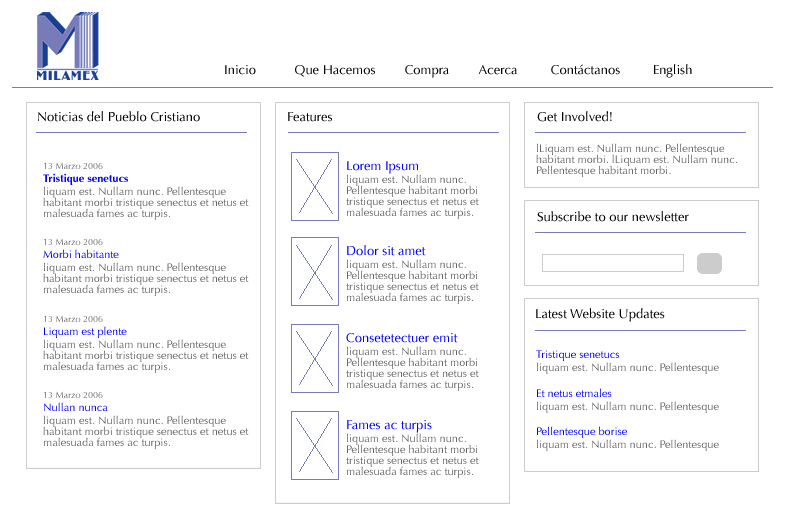
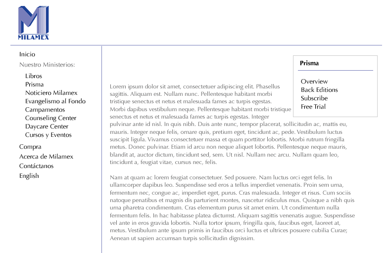
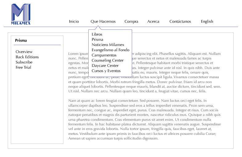
I produce page layouts as 'wireframe' diagrams, avoiding as much as possible any use of colour, styled text or other aesthetic consideration. I'm always amazed by this, but the one thing I consistenty experience in clients is how easily they get hung up over colours - almost as if that was more important than what will actually be on the website. Keeping diagrams as wireframes at this stage helps the client focus on what is important - I don't think you can really discuss colours effectively (and other graphics issues), until you have a better idea of what information is going to be on the page and how it's going to be arranged.
For Milamex I produced a proposed layout for the homepage, and two layouts for how the rest of the site would look. Click on the links below to see these wireframe diagrams (small GIF format images), then click on the 'back' button, to return to this page:
I presented these ideas to Sally in mid-May, and after some discussion the homepage idea was approved, and 'Page layout concept 2' was chosen as the template for the rest of the pages. Although, as ideas evolve, the final website may actually differ to some extent from what's shown here, these provide a good starting point from which to begin the design.
Stage 5: Page writing guidance
The last stage before I develop some proposed visual designs is to commission the actual writing of the pages themselves. Although the website is much more than an 'online brochure', there are still a fair wack of pages to write text for. The client is responsible for writing the text, though I want to bring my knowledge of how to write text for the web, before they start. I advise in ways to help make text as usable and readable as possible. I recommend on what key topics need to be discussed, how each page relates to the other, and how the information might be structured on the page. Furthermore, there are some tricks in text writing to improve listings on search engines like Google, which clients are always interested in learning.
With Milamex, I produced page writing guidance for each key page of the website (about 30 in total), as listed in the Tree diagram from Stage 3. I know that Sally, who will be doing the writing, is an extremely busy person. She doesn't really have the time to think from a blank slate on each of these pages, so the fact that I've done the ground work here, I believe will be a great help for her getting the pages written. I presented these to Sally a couple of weeks ago, so for a mid-August launch of Version 1, I'm hoping that she can have these pages back to me by about the end of July. But with all the deadlines that make that lovely 'swooshing' noise as they pass on by, we'll see if it happens ;-)
But at least while Sally's writing the pages, I can be getting on with my favourate bit, the design.
Where I'm at today
So here I am in early June, a mid-point of getting a 'Version 1' website complete. The remaining stages of the project are as follows:
- Stage 6: Visual design concepts
- Stage 7: Implementation - where I go ahead and develop the website
- Stage 8: User testing
- Stage 9: Bug fixing
- Stage 10: Launch
The visual design stage is quite exciting for me, but it can also be a bit frustrating if I'm lacking in creative ideas! I plan to give Sally 3 or 4 visuals from which we can work. No doubt the choice of colours will be a lively topic, but at the end, we will have a template on which we can build the design of the new Milamex website.
In my next progress update, I will put up screenshots of some proposed visuals developed during Stage 6, and discuss the thinking behind them.
If you've not guessed by now, I'm quite a methodical person.
posted by Tim Thompson | 2:01 PM
![]()
![]()


2 Comment(s):
Good to see the site design is progressing well. I think your methodical nature will help too - stop you getting bogged down in a little unimportant aspect and keep you on track. With any luck should be able to actually SPEAK to you on wednesday, through the magic of Lars & Sanna's technical expertise (as we are small-grouping at theirs).
Ciao for now,
ME Tuesday, June 13, 2006 2:01:00 AM
Who knows where to download XRumer 5.0 Palladium?
Help, please. All recommend this program to effectively advertise on the Internet, this is the best program! Saturday, November 21, 2009 3:34:00 AM
Post a Comment